
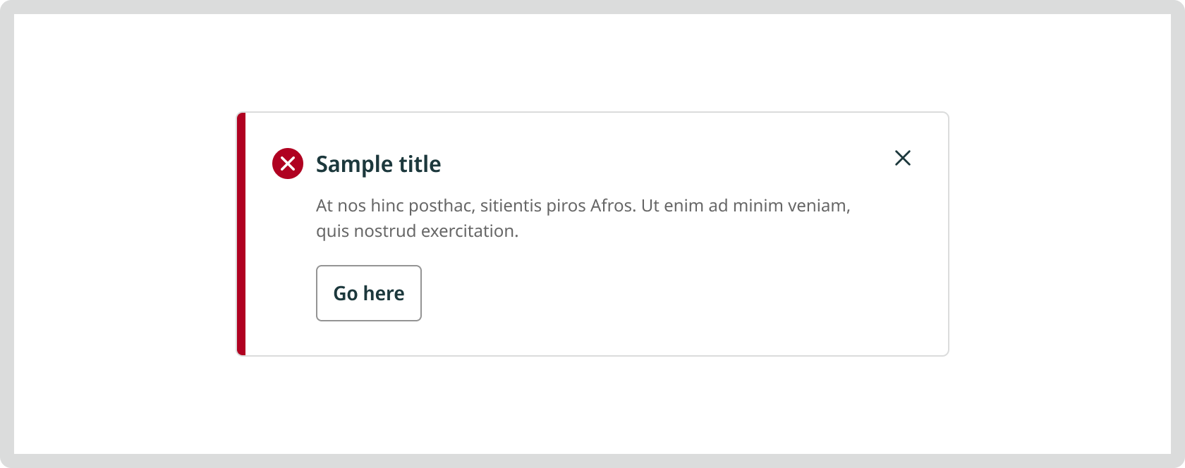
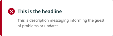
Message Block
A comprehensive message component used to communicate important information at the screen or section level. It can include a title, body text, and optional actions.
Props
Context
Subtypes of messaging blocks are used differently depending on the type of message they convey. Iconography and UI colour are unique to each type of messaging block.
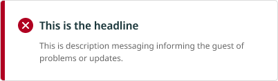


Dismissible
Toggle: Ability to remove the message from the screen.
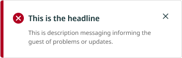
Actions
Toggle: Display an option call to action/button.
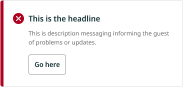
Body text
Toggle: Displays additional text alongside the headline.

Usage
- Avoid using multiple alerts on a single screen to avoid confusion and mixed messaging.
UX Writing
- Be brief and to the point
- Be clear and use human-friendly language
- The title of the messaging blocks should highlight the most important concept or piece of information about the message
- For errors, explain what error was encountered and give a clear actionable solution in polite phrasing which doesn’t blame the user
