
Message Link
A compact, actionable message that prompts the user to take a specific action. It combines a short message with a link or button to drive engagement or resolution.

Props
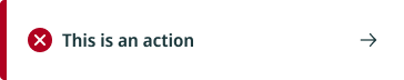
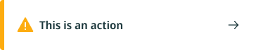
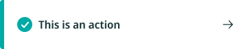
Type
Subtypes of messaging blocks are used differently depending on the type of message they convey. Iconography and UI colour are unique to each type of messaging block.
Usage
- Use when you need to alert the user to something minor but actionable, such as a dismissed notification or a prompt to retry an action.
- Avoid using multiple alerts on a single screen to avoid confusion and mixed messaging.
UX Writing
- Be brief and to the point
- Be clear and use human-friendly language
- The title of the messaging blocks should highlight the most important concept or piece of information about the message
- For errors, explain what error was encountered and give a clear actionable solution in polite phrasing which doesn’t blame the user
